
Case Study: Sleep Origin
The Brand Visual Upgrade That Changed Everything for a Newborn Care and Sleep Specialist
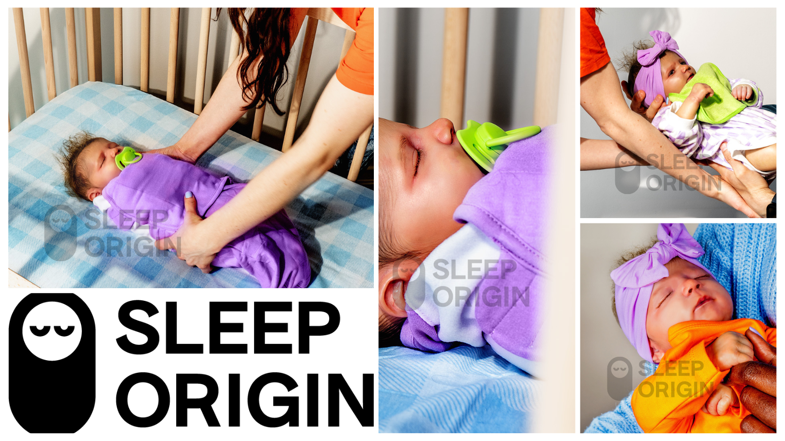
Natalie Treece, Newborn Care and Sleep Specialist - Brand visuals before Studio Abdul
The Client
Natalie Treece, Newborn Care and Sleep Specialist and founder of Sleep Origin, has built a thriving practice helping families navigate one of the most vulnerable and exhausting seasons of early parenthood. Parents trust her with their newborns, their sleep deprivation, and their peace of mind; and her brand needed to reflect that level of care and credibility.
Like many specialists who have poured everything into mastering their craft, Natalie knew her visuals weren't keeping up with the caliber of her work. So she did what any serious business owner would do, she invested in a solution.
The Challenge
Natalie went the traditional route first, assembling a full creative team: a photographer, a stylist, and a prop stylist. It was a real investment in time, coordination, and budget. The kind of commitment that shows how seriously she takes her brand.
The shoot just didn't land the way she'd hoped. Sometimes that happens. Creative vision is hard to translate, and even with the right people in the room, the result doesn't always match.
But beyond the aesthetic, there was a deeper challenge specific to her industry. Natalie works with real newborns and infants. Her business lives at the intersection of professionalism and privacy, and featuring real babies in branded content simply wasn't something she was willing to do. She needed imagery that felt warm, authentic, and true to the families she serves, without ever putting a real child in front of a camera.
That's when she found Studio Abdul.
SLEEP ORIGIN’S VISUALS BEFORE STUDIO ABDUL
Before Studio Abdul
The Approach
We started where every project begins: a discovery session.
Natalie walked us through her business, her audience, and what she needed her visuals to communicate. She came in with a clear creative instinct; she was drawn to high-flash photography, that editorial, high-contrast aesthetic that feels polished and intentional. Then she did something that made the project a joy to work on.
She trusted us completely.
"I trust your vision and your judgment," she told us, and we took that to heart.
From there, our team got to work building her brand world from the ground up. Every element was researched, sourced, and assembled with intention. Nothing was generic. Nothing was accidental.
Here's what that looked like:
1. The Nursery We curated every visual detail of the environment. The furniture, the lighting, the textures, the décor; designing a space that felt serene, elevated, and immediately trustworthy. The kind of nursery that says you're in good hands before a single word is read.
2. The Babies Because real infants couldn't be featured, we created them thoughtfully and deliberately. Each baby was designed with specific physical characteristics, placed in natural, lifelike moments within the scenes. The result feels genuine and emotionally resonant without compromising anyone's privacy.
3. The Mothers We built each mother entirely from scratch; unique faces, distinct hairstyles, and fully styled looks from head to toe. Every outfit, accessory, and detail was handpicked to reflect the real range of women Natalie works with. No stock. No shortcuts.
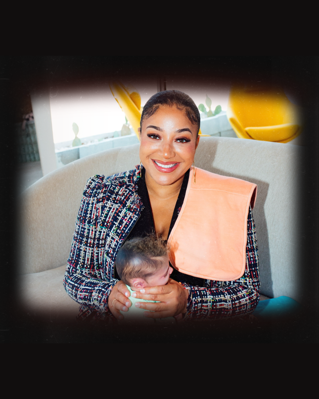
4. Natalie Herself — As a Bonus We didn't stop at the brand imagery. Using a photo of Natalie as our reference, we restyled her personally, selecting her outfit, shoes, and accessories, then placing her within the visual world we had created for her brand. She didn't just walk away with new brand photos. She walked away with a new brand presence.
The Results
Natalie was overjoyed!
After her first package, she returned three more times! Each time expanding her visual library with new scenes and new directions for her brand…
What started as a search for a creative workaround…how do I get professional imagery that reflects my brand without a traditional shoot, and without featuring real babies? - became a complete visual identity that finally matches the expertise and warmth she brings to every family she works with.
Her visuals now communicate:
The trust and care her clients need to feel from the first impression
The editorial quality that positions her as a premium specialist in her field
A cohesive brand world she can use across her website, social media, and marketing; consistently
What Made This Different
At Studio Abdul, we don't just produce images. We build brand worlds.
Every element of Natalie's project was researched, curated, and constructed with the same creative intentionality as a high-end editorial production; the strategic vision of a creative director, the eye of a stylist, the precision of a set designer. What's different is that our process removes the logistical complexity, the timeline pressure, and in Natalie's case, the unique privacy constraints that made traditional production the wrong fit.
The visuals aren't outputs. They are the result of deliberate decisions made at every level: the environment, the people, the mood, the palette, the story. Every single piece chosen on purpose.
For Natalie, that meant a brand that finally looks the way her business has always deserved to look.
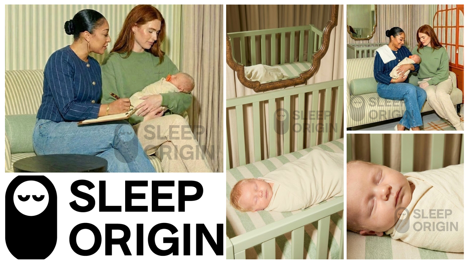
SLEEP ORIGIN’S VISUALS AFTER STUDIO ABDUL
After Studio Abdul
After Studio Abdul, Too…
The Creative Direction: Sleep Origin
What She Came In With
Natalie knew the feeling she wanted. She was drawn to high-flash photography, that editorial, high-contrast style that feels intentional and elevated. Her brand carries a bold, vibrant energy; Sleep Origin's palette is built on rich primary colors that are anything but understated.
And it's no surprise to anyone who knows our work that we have a deep love for bold color and a maximalist sensibility. So when Natalie came in with that direction, we were immediately excited.
But here's where the creative conversation got interesting.
The Decision to Pull Back
Natalie's website lives in full color; bright, confident, and distinctly hers. And while we both wanted to honor that energy, we also recognized that what works as a brand color palette doesn't always translate directly into imagery, especially for a website experience that needs to feel calm, trustworthy, and safe.
So together, Natalie and I made a deliberate decision: we would build her visuals in two distinct directions: one softer and more muted for the website environment, and one that brought her brand colors in fully and unapologetically.
At first glance, the two sets of images might feel like they belong to two different brands. They don't. They are two sides of the same visual world, and together, they give her brand incredible range.
Scene One: The Consultation
A muted, editorial warmth
The brief behind this scene was emotional before it was aesthetic: we wanted to show what it feels like to work with Natalie. Not what she does in a clinical sense, but the actual lived experience of a mother in her presence; the calm, the reassurance, the sense that someone deeply knowledgeable is right there with you.
To achieve that, we built the environment around softness and intention.
We chose a muted sage green as the foundation of the room - grounding without being stark, warm without being loud. Every textile was considered. The sofa you see in the scene was designed from scratch, including the fabric and the bolster. The rug was built from the ground up through deliberate compositional choices. Nothing was pulled off a shelf.
For the mother, we wanted her to feel like herself, comfortable, at ease, at home with her newborn. We styled her in designer loungewear rather than anything overly polished or posed, because the story we were telling was an intimate one. The pop of color comes in quietly: a carefully chosen pacifier, a glimpse of custom wardrobe in the background. Present, but not competing.
The nursery within the scene follows the same language…subdued, serene, designed to evoke calm. Because that is ultimately what Natalie delivers. That is her result.
Scene Two: The Result
Bold, maximalist, and entirely on brand
This was actually the first scene we built and it's one of our favorites!
Where Scene One whispers, this scene speaks. The concept here was the other side of Natalie's story: what it looks and feels like after working with her. A mother who has come through the other side of sleepless nights. Rested. Confident. Settled into a new rhythm with her baby.
We really leaned into Natalie's brand colors fully here and we did it through the design of the room itself.
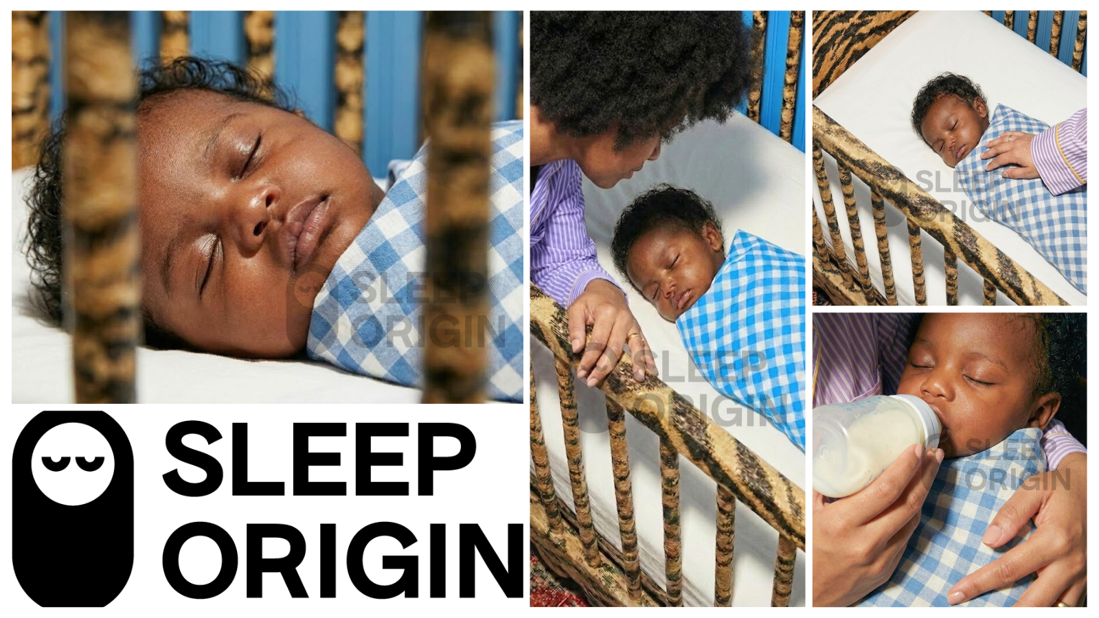
The centerpiece of the scene is a custom crib wrapped in a Schumacher tiger print fabric. Bold, rich, and completely specific. To bring the energy back into balance, we dressed the crib in a clean white sheet and then rewrapped the baby in a gingham print that echoes the colors of the surrounding space.
To ground everything and weave in the warm neutral tones, we layered in a traditional vintage persian rug. The kind of rug that bridges the boldness above it and adds a sense of history and depth to the room.
The result is a scene that takes a maximalist approach while maintaining a sense of considered restraint. There is a lot happening and yet nothing feels out of place.
When we first presented this scene, the middle image came through noticeably brighter than the others, a first test with her full brand colors at maximum saturation. Natalie and I both felt it needed to breathe a little more. So we made the call to dial the palette back just slightly, keeping the boldness intact while letting the scene settle into something that felt intentional rather than overwhelming.
That one conversation - let's pull this back just a touch - is exactly what creative direction looks like in practice.
Two Scenes. One Brand.
What you're looking at across both sets of images is not a contradiction. It is a complete brand story told in two chapters:
Chapter one is the experience, what it feels like to be in Natalie's care. Chapter two is the outcome, what life looks like when her work is done.
Together they give Sleep Origin a visual identity with depth, range, and real emotional resonance. The kind of imagery that doesn't just look good, it says something.
Ready to see what we can build for your brand? Click Here