COLOR CLOCKS IN.
A celebration of women in motion
(YEAR)
2026
(TIMELINE)
3 Days
(SERVICES)




At 8:00 a.m., New York is already moving.
Apartments are waking up. Coffee is being carried out the door. Subway stairs are filling. Cabs are pulling to the curb. Women are crossing streets, taking calls, catching trains and moving toward wherever the day is asking them to be.
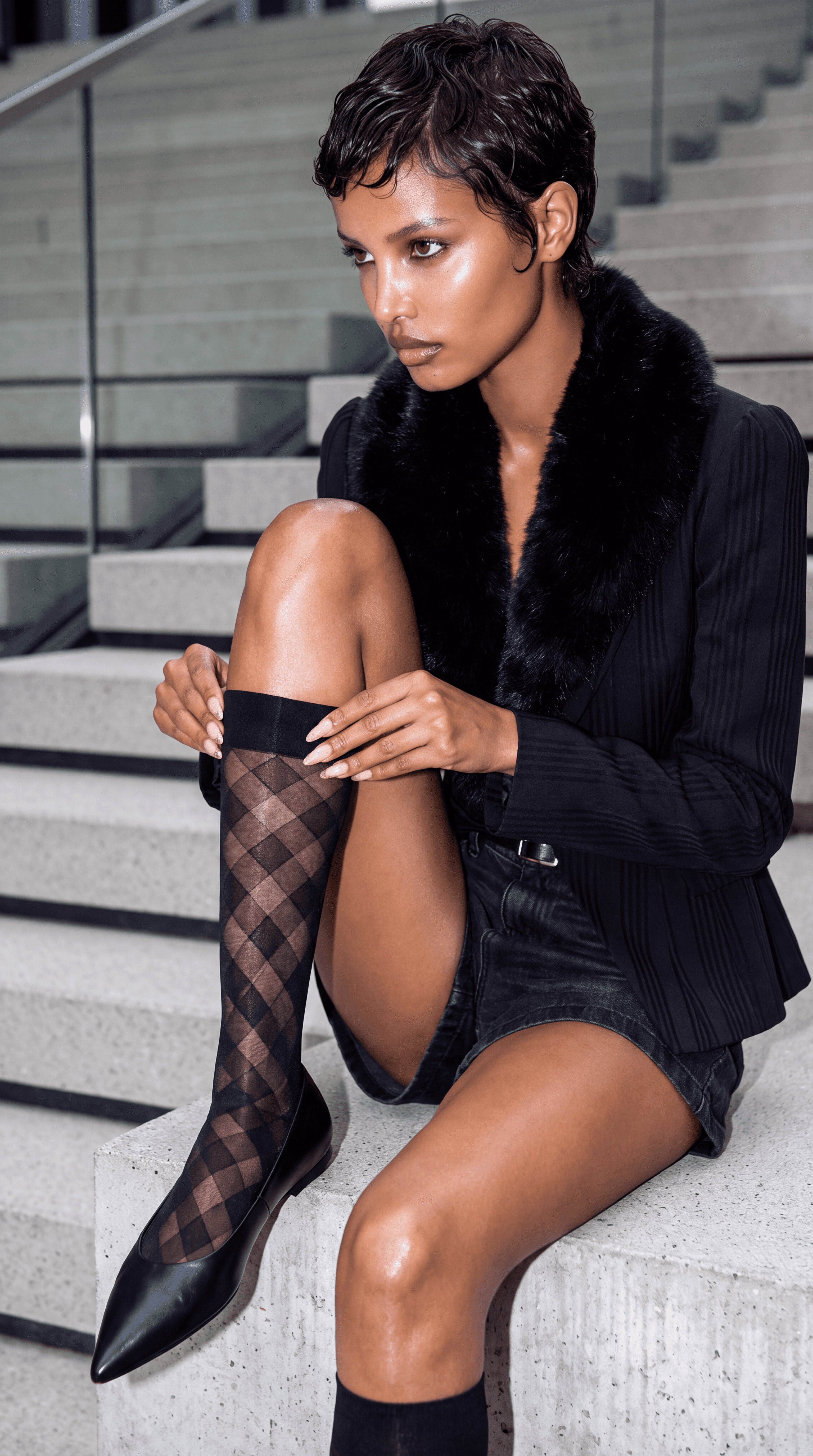
COLOR CLOCKS IN follows a cast of women through that first rush of a fall morning, each with her own destination, wardrobe and point of view. What connects them is HUE. Sheer tights, opaque stockings and saturated color become part of the rhythm of getting dressed and getting out the door.
One woman emerges from the subway as the morning sun begins to hit the buildings. Another steps out of a yellow cab with one leg reaching toward the pavement. Another pauses on a park bench with coffee before continuing downtown. Across the city, coats fall open to reveal flashes of unexpected color beneath them.
Fall does not mean packing away the personality of summer. It does not mean every wardrobe suddenly becomes black, gray and invisible. These women are still showing their legs. They are simply dressing them for the season.
Color becomes both function and attitude. A bold opaque tight transforms a neutral coat. A sheer stocking adds another layer to a short skirt. Burgundy, orange, green, plum and unexpected brights move through the city against concrete, brownstone, steel and the changing leaves of New York.
COLOR CLOCKS IN is a celebration of women in motion and the small decisions that make everyday dressing feel personal. The temperature may have changed. Their relationship with color has not.
The campaign began with a seasonal opportunity: how can a heritage hosiery brand make tights feel like one of the most exciting pieces in a fall wardrobe rather than simply something worn because the weather changed?
HUE has long occupied a distinctive position in legwear through its range of color, opacity, texture and styling. Rather than treating hosiery as a supporting category, the campaign moves it to the center of the fashion story.
Each woman is styled around a different expression of HUE. Bright opaque tights appear beneath short skirts and long open coats. Sheer stockings create a quieter layer beneath polished tailoring. Saturated color interrupts otherwise restrained fall palettes. The hosiery is never hidden. The styling and composition are deliberately built to make the leg visible.
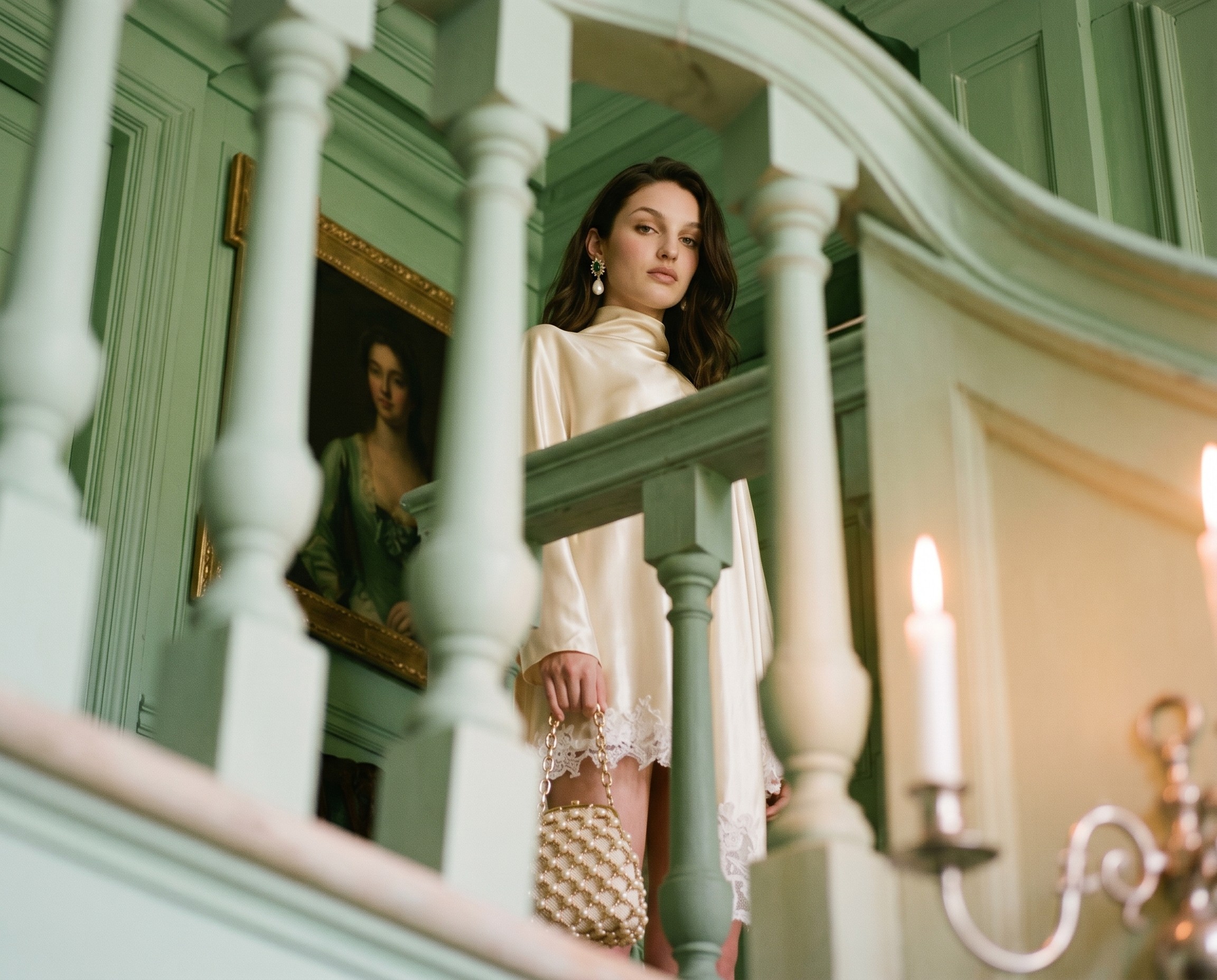
The visual architecture follows the movement of a New York morning. Bedroom. Stairwell. Subway. Sidewalk. Taxi. Crosswalk. Coffee stop. Park bench. Each location advances the feeling of a city coming alive while creating a new reason to photograph the product.
Close waist-down compositions turn individual stockings into hero products. Wider street photography establishes character and place. Low-angle subway exits exaggerate movement and length. A leg extending from a cab creates a natural product reveal. Open coats frame the hosiery rather than covering it. Every composition is designed around the same question: where are the legs, and what is HUE doing to them?
The photography borrows from candid New York street style, fashion editorial and early-morning commuter photography. Direct flash, natural sunrise, wet pavement, moving traffic and tightly framed details keep the world polished without removing the energy of the city.
The result is not a catalogue of tights. It is a wardrobe system built around women who have somewhere to go.
The commercial strength of COLOR CLOCKS IN is its ability to reposition hosiery as a seasonal fashion purchase rather than a cold-weather necessity.
HUE does not have to sell women on covering their legs. It can sell them on another way to style them.
One core campaign can support an entire fall content ecosystem across hero film, short-form video, social, paid media, email, editorial stills, product-focused photography, transit-inspired creative and seasonal landing pages. Each woman, outfit and colorway creates another campaign variation while remaining inside the same recognizable New York morning.
That structure also gives HUE a natural way to merchandise breadth. Opaque tights, sheer stockings and different color families can each become individual chapters without requiring an entirely new creative concept for every product. The city provides the continuity while the legwear provides the change.
The campaign creates multiple entry points for different customers because there is no single HUE woman. One is polished. One is playful. One is minimal. One is dramatic. One is already running late. What they share is the understanding that practical dressing does not have to become predictable dressing.
Most importantly, the concept gives HUE ownership of a repeatable seasonal moment: the morning when women realize it is officially too cold for bare legs but they are nowhere near ready to stop wearing the clothes they love.
That is where HUE becomes more than hosiery. It becomes the thing that keeps the wardrobe going.
The city wakes up. The temperature drops. The women keep moving. And color clocks in.
Disclaimer: This is an independent concept case study created by Studio Abdul for portfolio purposes. It is not affiliated with, commissioned by, endorsed by, or produced in partnership with HUE.