SLEEP ORIGIN
The Brand Visual Upgrade That Changed Everything for a Newborn Care and Sleep Specialist
(YEAR)
2026
(TIMELINE)
7 Days
(SERVICES)
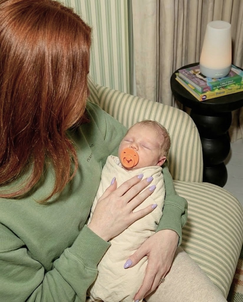

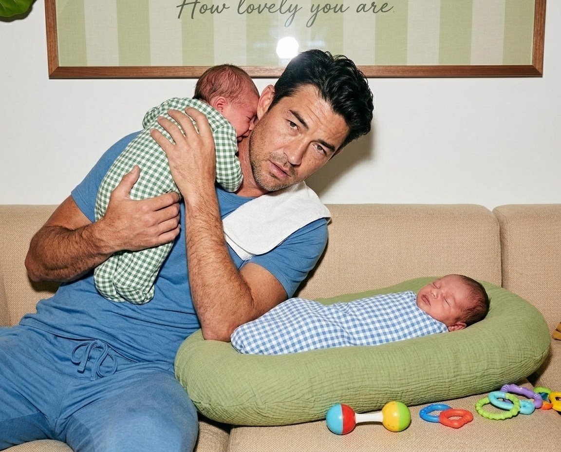
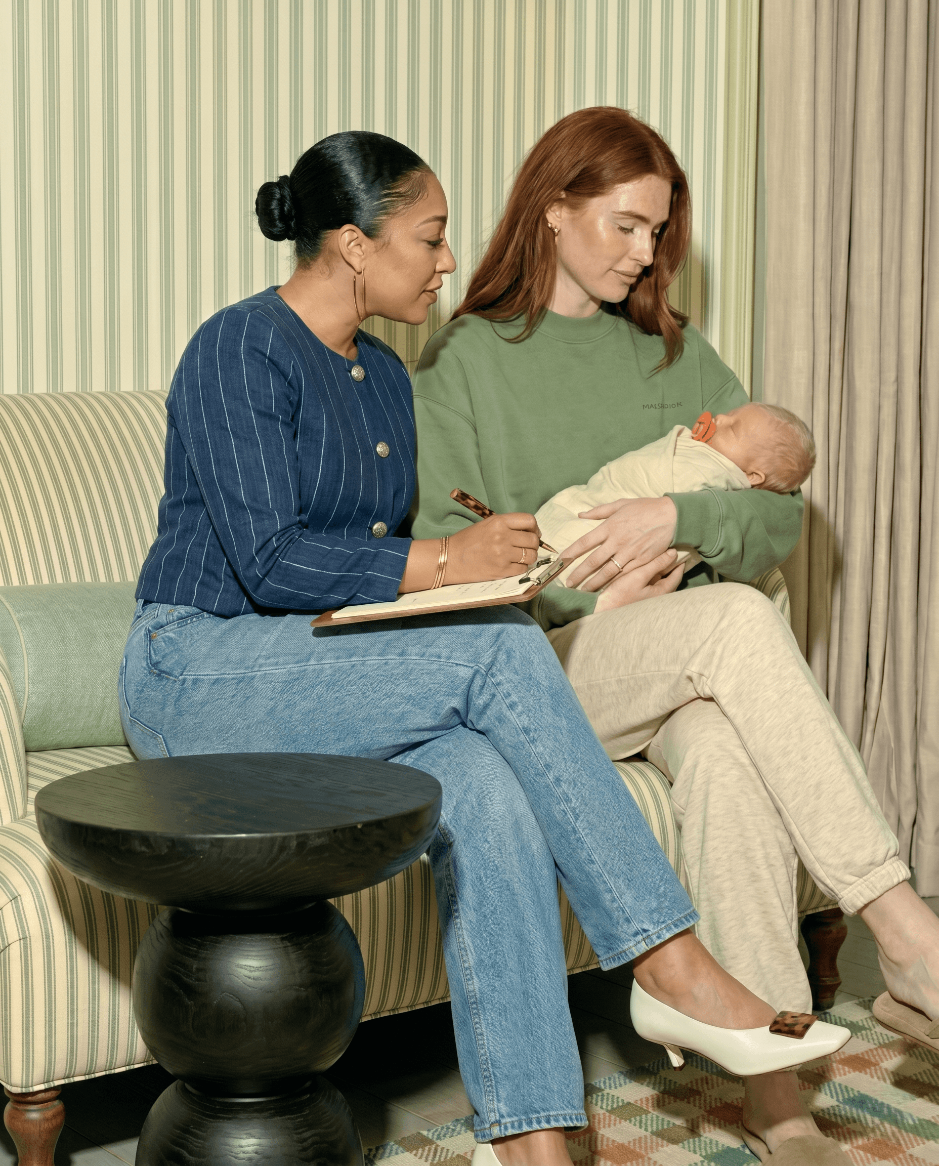
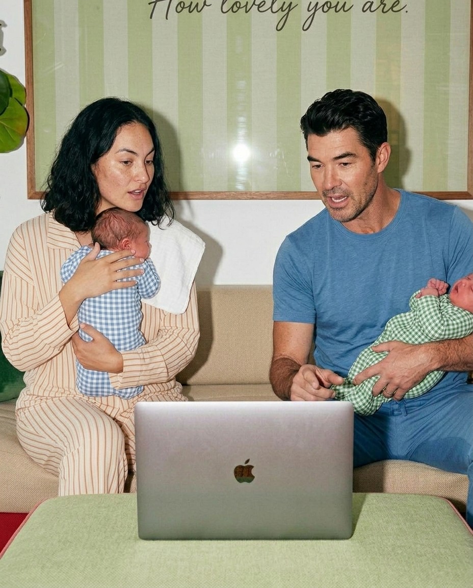
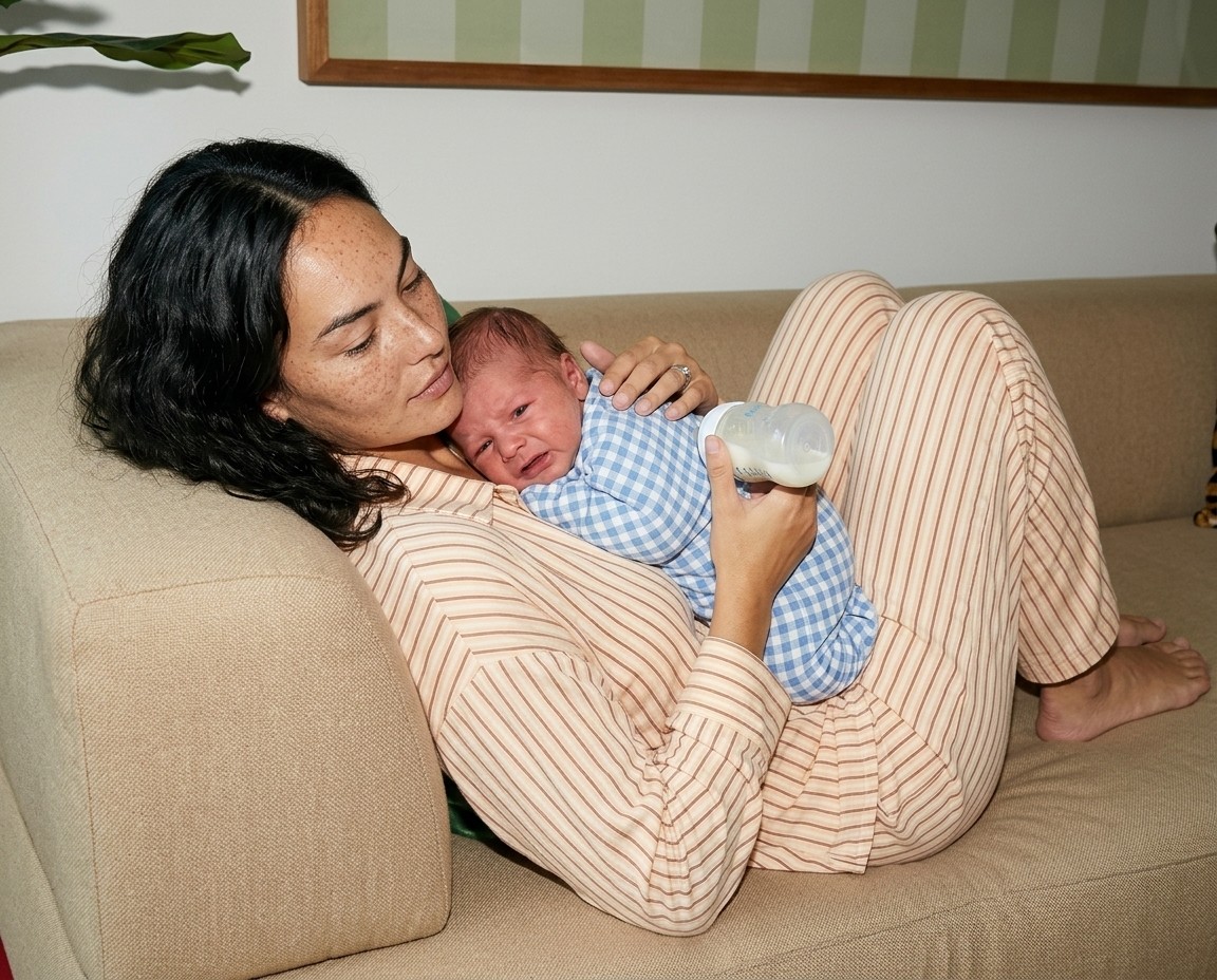
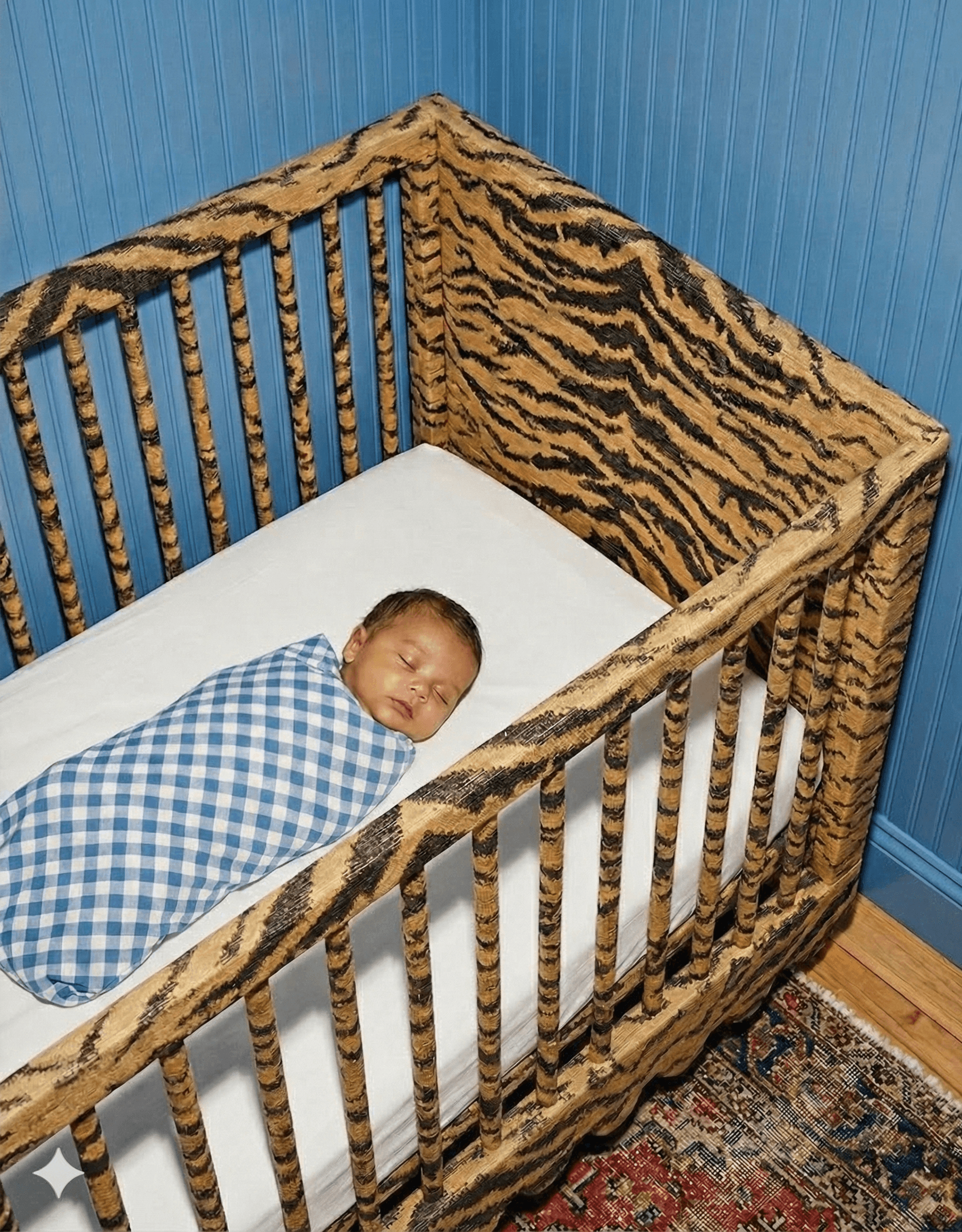
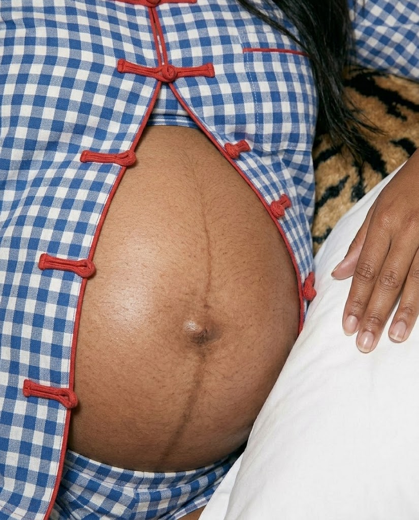
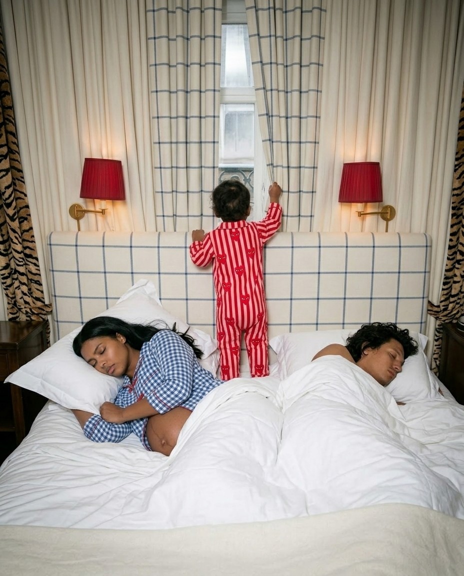
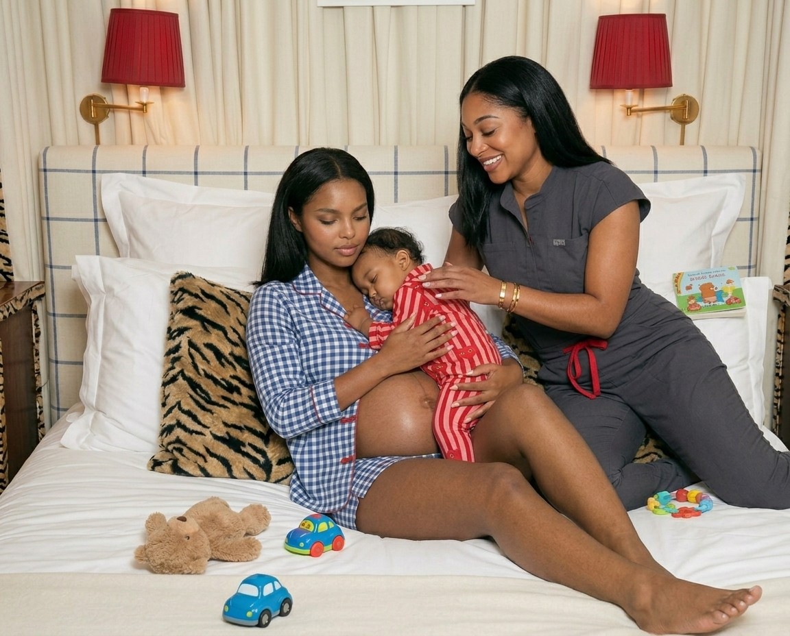
The Sleep Origin archive is a high-end visual exploration of maternal transformation told in two distinct, editorial chapters. The first chapter frames the intimate clinical consultation using a soft, muted palette. Built around grounded sage green tones, custom-designed textiles, and premium designer loungewear, the universe evokes a sense of deep safety, clinical expertise, and absolute calm. The second chapter captures the bold, confident aftermath of restoration. This scene shifts into high-contrast, maximalist energy featuring a custom crib wrapped in a rich Schumacher tiger print fabric, balanced by traditional vintage Persian rugs and vibrant primary brand colors. The visual lore purposefully avoids generic stock tropes, creating unique, highly styled digital mother profiles and lifelike infant subjects. The result is a premium, emotionally resonant brand world that communicates trust and authority on first impression.
Natalie, the founder of Sleep Origin, came to Studio Abdul with a deep creative instinct for high-flash, editorial photography. However, her elite maternal wellness practice faced impossible operational constraints because traditional commercial photoshoots were entirely blocked by infant privacy liabilities, high logistical friction, and the sheer unpredictability of working with real newborns. Furthermore, translating a bold, bright corporate color palette into a website environment that must simultaneously feel calm and safe required a delicate strategic calibration.
Studio Abdul dismantled these barriers through Advanced Digital Synthesis. Working entirely on our backend, we engineered the entire visual ecosystem from scratch in seven days. We custom-built detailed nursery environments, cast distinct digital mother and infant profiles, and even restyled Natalie herself to elevate her personal corporate presence. We delivered two distinct, highly strategic visual directions, using muted tones for the website infrastructure and high-saturation colors for multi-channel marketing, eliminating her logistical pressure and privacy risks completely.
True visual infrastructure must permanently bridge the gap between a founder's internal expertise and their external brand prestige. By replacing generic creative alternatives with our high-end, structured asset archives, Sleep Origin instantly established an undisputed position as a premium specialist in the maternal wellness field.
The impact was immediate and compounding. Rather than executing a single, commoditized project launch, the complete transformation of the brand's visual identity drove the client to return three consecutive times to expand her campaign archives across new marketing channels. By delivering extreme creative range and flawless frontend alignment across her entire digital flagship, Studio Abdul secured Sleep Origin's capacity to scale, protected her digital conversion funnel, and proved that digital synthesis is the ultimate asset for high-ticket service enterprises.